
 One of my goals this year is better pictures, at least for etsy and my website. So here is an attempt to better capture clear/white items. First up is a lovely pendant I made ( and it's a "hint" on the challenge piece, hint hint) with clear crystals and pearls. It's about 2 inches around if you are curious.. against new "normal" background, it looks alittle washed out.
One of the websites for photo tips suggested black velvet. Second photo is black velvet.. while it really "pops" it does lack some detail.. I think in this case my lighting was too strong!
 Here is another case, a pair of earrings in sterling and clear crystal. Again, it pops on the black, but the silver is too bright and lacks detail. Last photo is just the black.. the light background didn't turn out at all.
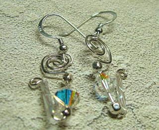

 Here is another case, a pair of earrings in sterling and clear crystal. Again, it pops on the black, but the silver is too bright and lacks detail. Last photo is just the black.. the light background didn't turn out at all.
 Let me know what you think!


2 comments:
It's great that you're experimenting with backgrounds. They definitely make a huge difference, along with proper lighting. I've been working on my photo technique as well, and I've learned that black is usually too harsh. It's often better to go with a dark color, like a deep green or purple or dark blue, to get a good contrast.
Also, try experimenting with different angles in the photos. That can make a difference in how the light reflects off the piece (especially with crystals).
Good luck! I'll be on the look out for your progress...
Liz
I've been feeling the same way lately. So far I've only been using the white background of my homemade light box for my jewelry pieces, but I want my backgrounds to really work with my pieces. The white now just seems sort of drab. So I'll be experimenting this year as well.
Post a Comment